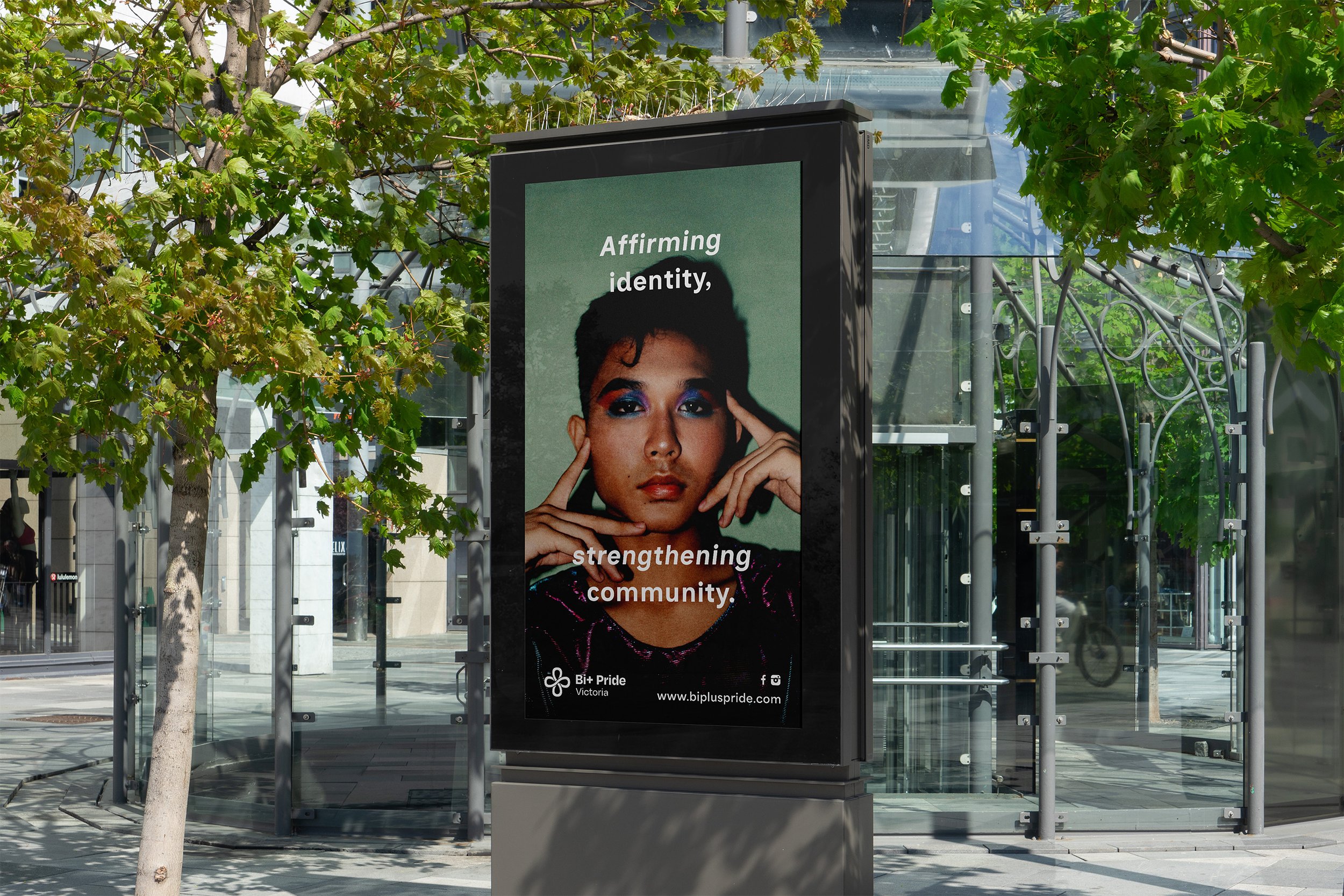
Branding for Bi+ Pride Victoria
Visual identity for Bi+ Pride Victoria - a newly merged organisation, which is now the peak representative body for Bi+ Victorians.
Their mission? To uplift the wellbeing of Bi+ folks across Victoria through education, advocacy, and community building — both within the LGBTQIA+ community and in broader society.
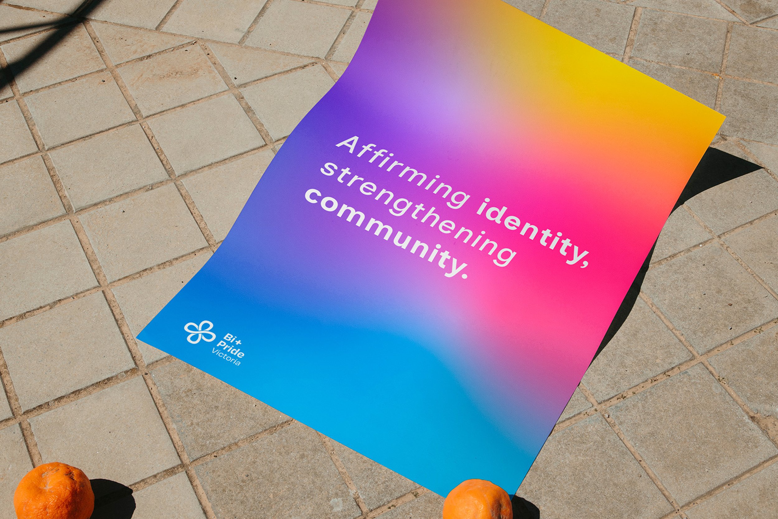
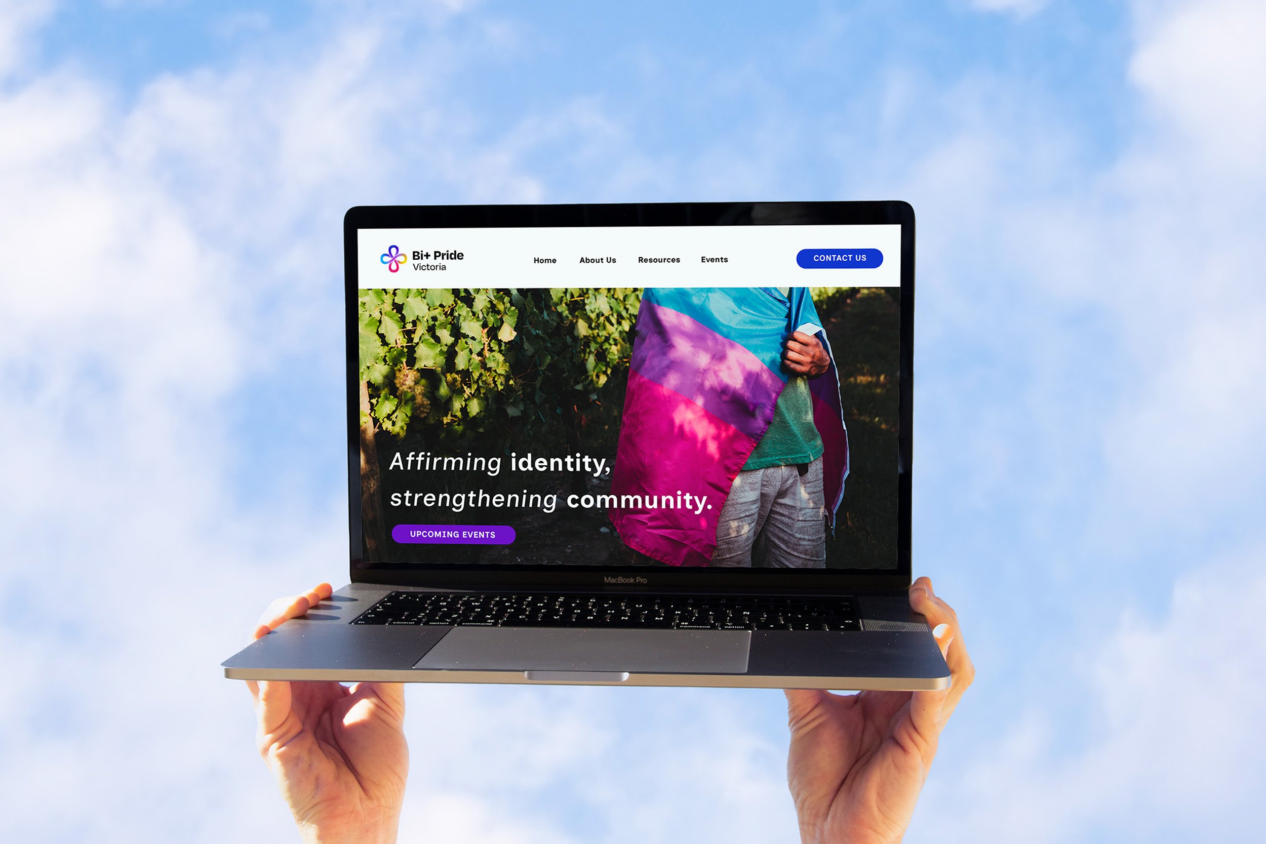
We set out to design a brand that proudly represents the diverse Bi+ community of multi-gender attracted Victorians — including pansexual, non-binary, and transgender folks. It was such a joy to collaborate with the committee and help shape this vision from the ground up.
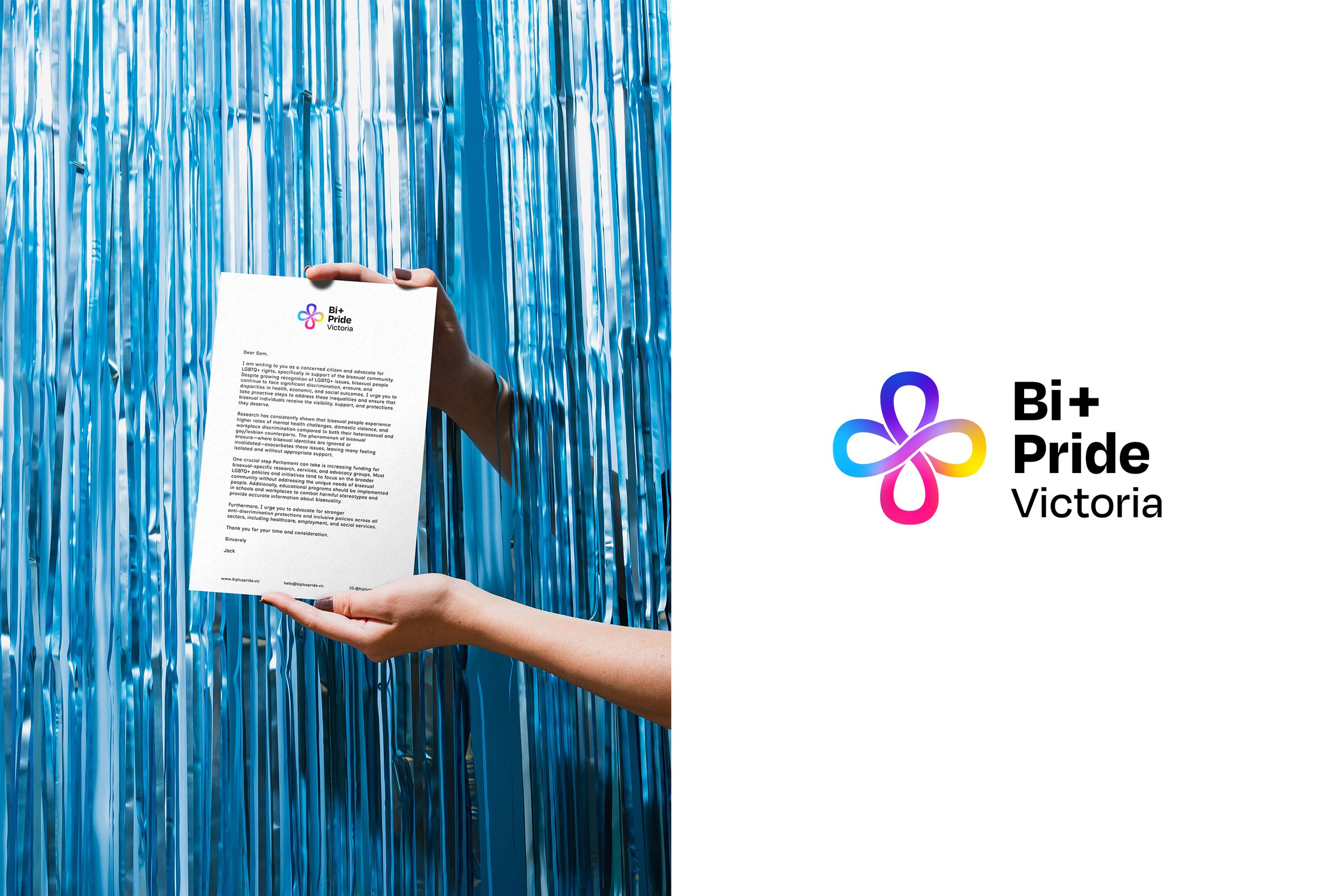
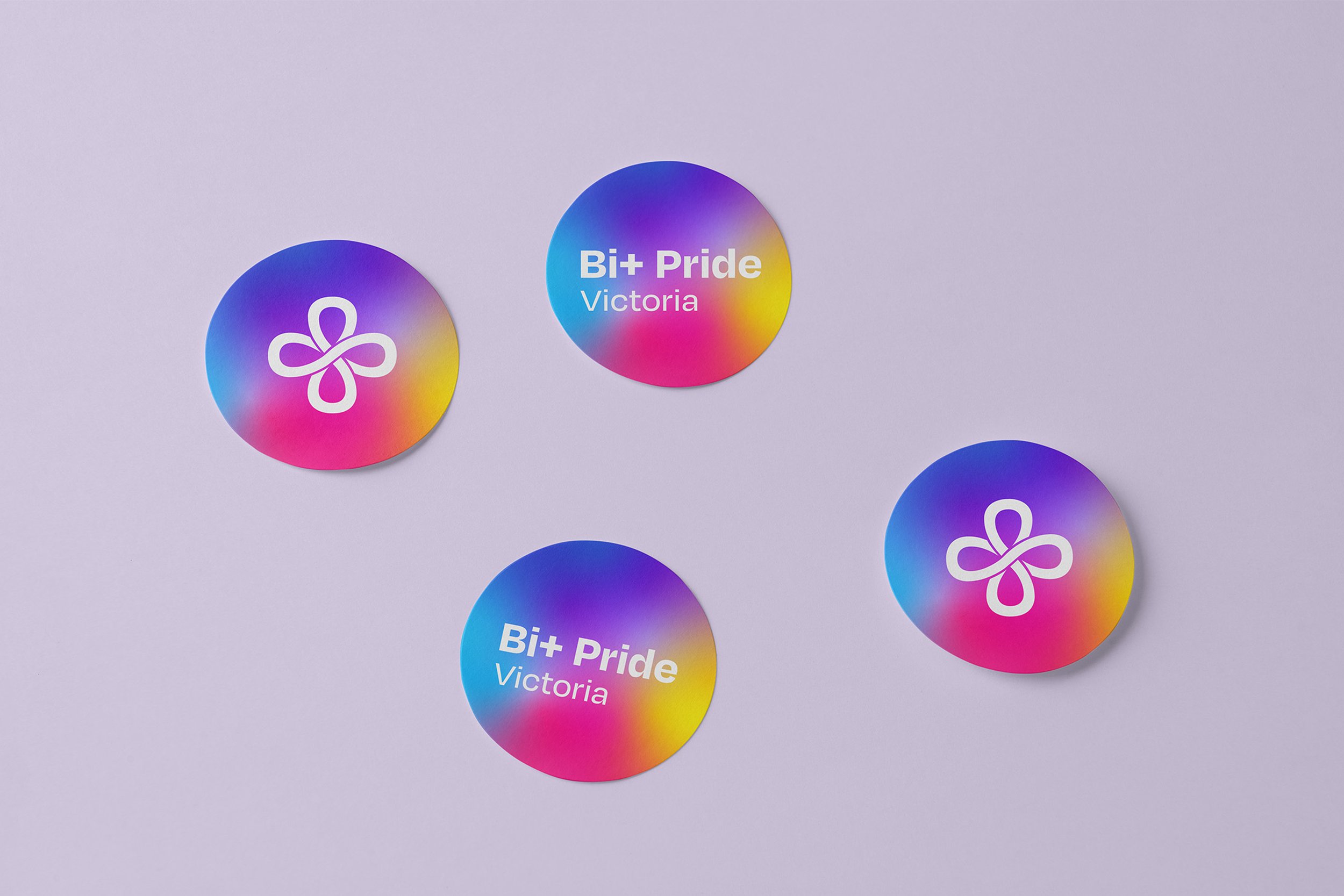
THE BI-CON: There is a large overlap between the Bi+ community and the neurodivergent community. By integrating the infinity symbol, which is used to represent neurodivergency pride, and doubling it within the Bi+ Pride Victoria icon, this creates both a ‘plus’ and a double infinity symbol, which in mathematical terms expresses perfection.
It’s a clear message that your own combination of sexuality and brain makeup is perfect no matter what.
Brand Workshop
Art Direction
Visual Identity